Thursday, August 11, 2011

Keeping the ball rolling ...

To keep the momentum building on my blog, I thought I'd share some old news that I neglected to mention weeks ago. My friend John Tomac, illustrator, designer and former high school and college teammate, had an illustration printed in the July issue of Runner's World magazine. RW Art Director Kory Kennedy (formerly of Rolling Stone) works with some pretty big names in the industry, so getting into Runner's World is a huge deal.

But not only did John get an illustration in the magazine, it was a full-page piece (a page ahead of Lance Armstrong's article ... fitting), narrating his own story of running and survival. Please click on the image to read the entire thing:


There is also a short video online featuring John's process.

And if you are inspired to do so, please donate to his cause.

Tuesday, July 26, 2011

Return to Blogging: Of Limited Loyalty

This is obviously my first blog post in quite a long time. Over the past couple of months, I felt uninspired about the state of my own work. It did not affect the quality of the work I was creating (recent work has been pretty good, actually), but I certainly did not feel like blogging. It's very hard to fake enthusiasm, so I decided to spare the Internet community my thoughts until I had something meaningful to say. So here it is: my return to blogging.

Back in February, I was assigned the sequel to At the Queen's Command, by Michael Stackpole. The aesthetic of the sequel was similar to the first; I needed to imitate the style of 18th century painting but depict an 18th century in which dragons, zombies, and a mysterious race of underground-dwellers shared the earth with humans. And while At the Queen's Command asked for a specific painting to mimic, Of Limited Loyalty was a little more open-ended.

The short story is that I went with these two John Trumbull paintings:


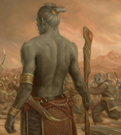
The top painting would serve as the model for the composition and the bottom would provide color inspiration. I took that basic outline and began planning where the major characters in the book would go. The dragon (or wurm, technically) in At the Queen's Command had been transformed into a larger monster with wings and Gila Monster coloring. Also important were the grey-skinned, magical humanoids that were to be shown in conflict with the humans. I tied these creatures together, and replaced the figures in the Trumbull painting with the book's characters. The sketch I submitted was approved on the first round and I was ready to go to final.

I prepped the 20x30 canvas and used a projector to transfer the sketch to the final size. Here, I'm tracing the projected sketch onto the final surface.


But I had much more drawing to do. The traced outline was only a compositional guide. I still needed to refine the drawing much more. Below, you can see the final drawing taking form over the loose outline. The biggest problem was the character in the fur cap. He went through many revisions until he didn't look like he was shooting the main figure in the back.


The following animation shows my progress after each work day. Fifteen stages over fifteen days … just in time for the deadline.


I painted a loose color study before working, so I knew the hue and values I wanted over the entire painting. As a result, I could work on small areas of the canvas and be fairly certain the whole thing would tie together. I could paint a small amount of background color around each character and then work on the figure, so that I could get the edge quality I needed right away; I wouldn't have to go in later and try to blend all the edges to various degrees.


So anyhow, here's the smallish version of the whole illustration (click for a bigger view).


And some details:


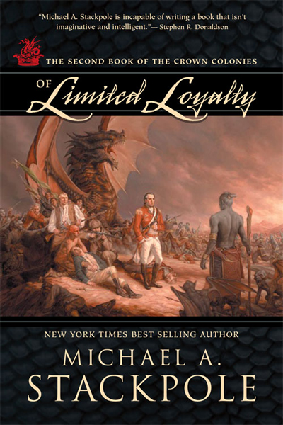
And the final cover from Night Shade Books:
Friday, April 22, 2011

Spectrum 18 entries

These are the two pieces that got into Spectrum 18. At the Queen's Command got into the Book category and The Victor in the Uncommissioned category. I submitted five pieces and I figured these were the ones that had the best chance to get through the judging.


Tuesday, April 19, 2011

Switching gears

A couple new jobs came in, so I decided to put off the photo reference session mentioned below to another day. As is so often the case, I now need to switch gears and go back to sketching. As I have things to post, I will post them.

I the meantime, check out my dad's new office; the only collection of my work on permanent display ...

Friday, April 15, 2011

The process continues ...


Today, I continue preparing the canvas. Usually, I use Yes brand canvas, which is halfway between canvas and paper. It provides a fine grain texture that is easily adjusted for your specific use. I'll usually go over the surface a few times with gesso. I'll usually leave brushstrokes going in a horizontal direction or get more creative, letting the brushstrokes follow the action.

Once there are enough layers of gesso, I'll sand the dried surface gently to smooth out the sharp bumps and brushstrokes. After sweeping away the gesso dust, I will usually prop the canvas against the wall and coat the entire thing with a layer of water, starting at the bottom and moving up.

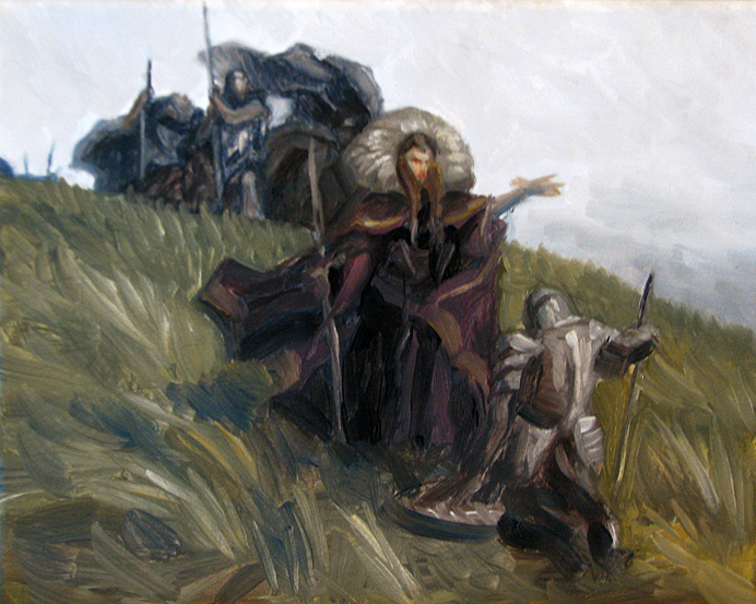
Pictured above is my color study. We have a defeated knight, surrendering to a dark queen and her minions. Or, perhaps he is willingly joining forces with her. The story doesn't matter to me as long as there is a story. Being ambiguous is good; it allows viewers to interpret their own adventure.

As for the palette, I have a small variation on a combination I discussed earlier: Ultramarine Blue, Transparent Red Oxide, Yellow Ochre, and Winsor Red.

Tomorrow, I will try to shoot photo reference.

Thursday, April 14, 2011

Easter Island

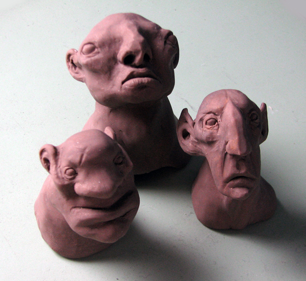
I might get a chance to do a personal project in the coming weeks ... or possibly, get started on one. I'm hoping to make it big (30x40) and supplement it with some fairly involved photo reference. So while I collect props and costumes (and models), I got a jump on things and sculpted some trolls. The mini monoliths are now watching over my drawing table.

The rest of the project is still in the thumbnail stage ...

Friday, April 8, 2011

I (sort of) won an award (I think)


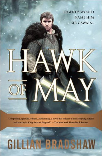
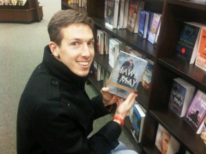
I just found out that the cover for Hawk of May won a PubWest 2011 Silver Award in the Jacket/Cover Design - Small Format category. When I first heard the news, I'll admit, I had to look up what it meant.

PubWest is Publishers Association of the West, a trade organization. This is the 27th year of their Design Awards. Jacket/Cover Design - Small Format category means "Books of any genre/category with strong shelf appeal and use of design, photography, artwork, and/or typography to enhance the subject matter."

Designer Pete Garceau deservers much of the accolades, but as the illustrator, I'm taking pride in it, too.