Friday, January 28, 2011
Vedalken Infuser
This new Magic card had no concept from the art director, other than, "paint me a cool Vedalken of your design." This is great for an artist to hear and I think in this piece I did what I had hoped to accomplish. I just wish I had planned out a stunning background, but at the time I wanted to simplify for some reason. That said, it's still the best of my recent work and the only one I will post to my site.
I provided a detail to show you what I was most proud of. Whether by the grace of the art gods or by luck, I was able to maintain the transparency of the shadows. I love this effect, but can rarely achieve it. The opaque illuminated head merges quite nicely with the brushstroke-y transparent shadows.
Friday, January 21, 2011
Tangents are annoying.
As I was putting down my most recent project on canvas, I was struggling, as I always do, against tangents. Tangents are an interesting feature of high school geometry, but are very annoying for artists.
For instance, take a look at the two T. Rex above. You can't really tell which Thunder Lizard is in front of the other, or whether they have dipped their tails in a tar pit and are stuck that way. The tangent of their two tails meeting is uninformative and draws way too much attention to itself.
Above is an improvement. Now we have more information, a little visual weight and we can now concentrate on the subject of the drawing.
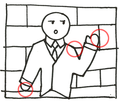
But tangents get more annoying as the complexity of the image increases. In this drawing, All the circled points need to be addressed. Either I need to change the proportion of the bricks, or I need to change the position or pose of the figure. The shoulder area is not really a tangent, but the meeting of the shoulder with the brick edge is distracting.
Monday, January 17, 2011
Wednesday, January 12, 2011
Jeffrey Jones Documentary
Jeffrey Catherine Jones is one of my favorite artists. His work is emotionally evocative and mysterious and unlike any other in the field. Part of the reason I like him so much is because his early work is a little rough and maybe a little too Frazetta-derivative. His recent work, however, is breathtaking. Jones' growth as an artist gives me hope. Improvement is possible!
That is why I'm so excited about BETTER THINGS: The Life and Choices of Jeffrey Catherine Jones. I really, really hope it is released.
Visit MaCab Films to see more footage and a longer cut of the artists interviews.
If you are an artist who wants to make sure this project is released, consider making a donation.
Visit MaCab Films to see more footage and a longer cut of the artists interviews.
If you are an artist who wants to make sure this project is released, consider making a donation.
Tuesday, January 11, 2011
Updates, updates ...
I'll be honest. In recent weeks, I have sort of been climbing out of a professional hole. While fixing mistakes and trying to get ahead, I have not been blogging. Meanwhile, my friend Steve Belledin has been writing some great posts over at his blog. I'm feeling outblogged, so here we go:
While finishing assignments I can't show you, I have been gathering the last of my Spectrum entries. This year I'm making some changes to the presentation of my entries. For the first time, I'm using plain old CVS photo prints. These look amazing and even if the color is off a little, the price is right. Plus, I'm spacing out the delivery of my images so I won't be competing against myself on the judges table. If they accept more than one into the book I will know if my plan worked.
Also, I was so impressed with James Gurney's Color and Light, that I ordered the book most people read first: Imaginative Realism. I'm almost done reading it. I would love to show it to anyone who has asked, "What do you do?" It's the step-by-step textbook for any artist creating fantasy works in a realistic style. I'll say it again: I wish I had this five years ago.
I'm also working on personal assignments whenever I have a chance. My goal is to create three large scale personal pieces this year. I'm getting there in five-minute-intervals.
Sunday, January 2, 2011
Useful reading ...
I started reading James Gurney's Color and Light. It has been making a huge impression on the entire field, so I was looking forward to digging in. Turns out it's just as good as every other artist says it is.
So far, everything I have read has indicated that I'm on the right track (a good feeling), or has answered a nagging question that has never been answered for me. The list of oil color pigments in the back is worth the price of the book. I'm not even half way through and the good stuff is still to come!
The frustrating thing, of course, is that I wish I could have read this five years ago. Any serious young artist out there should snatch this up quick. Buy it here.
Subscribe to:
Posts (Atom)