Showing posts with label my method. Show all posts

Thursday, September 22, 2011

...And the rest of Innistrad

Here are my final three cards in the Innistrad set. I don't have too many things to say about these particular pieces and I don't have the full-size art yet. But while I wait for the originals to come back from Wizards, I'll share some thoughts.
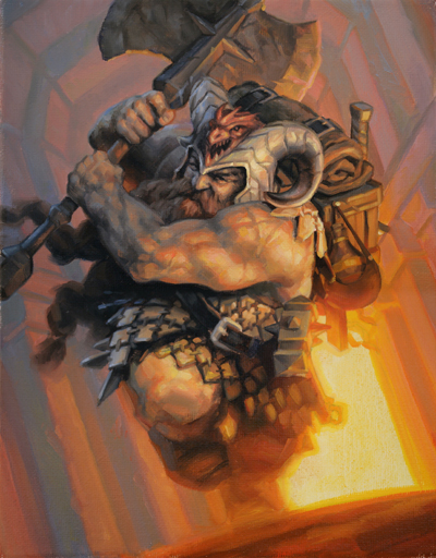
Unruly Mob was my final Zorn palette (cadmium red, yellow ochre, black, white) Magic card. You can't really see him too well, but the guy with the axe is one of my favorite human characters that I have painted for Magic. I don't even know why. I just think he's cool.

In Innistrad, for every standard piece commissioned to me, there were one or two pieces where the character was breaking into or out of something. Breaking out of a window, breaking into a cottage, or in the case of Claustrophobia, out of a coffin.

I painted this one upside-down for most of the process. I was trying to figure out why it didn't look right and finally realized that I had painted his cuffs falling toward the lid of the coffin. I repainted that area to fix gravity.

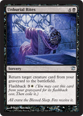
For Unburial Rites, the "breaking out" theme continues with a corpse trying to break out of a crypt. There was a time last year when I wished my characters could just stay where they were.

Tuesday, August 30, 2011

Mayor/Alpha sketches

Below are the sketches I submitted for Mayor of Avabruck and Howlpack Alpha. You can see that in the sketches for the mayor, I was going for a more peaceful, relaxed, intimate scene. The assignment required that I include the mayor studying a map in front of a big window (or with the window somewhere in the room behind him). The trick would be to get the lighting right. I had a general idea, but I ended up taking very, very complete photo reference.
The success of the piece hinged on the detail and subtlety of the lighting, something that in hindsight I could have done better. At the time, I was also still trying out the Zorn palette (cadmium red, yellow ochre, black and white), which didn't make the job any easier. However, I did have fun designing the mayor. To this day I still dig his outfit, regardless of what others think. I think its Gothic-derivative, but not colonial. Plus, he has a cool collar to ward off vampires (even though he should have been worried about werewolves, apparently).

I did a ton of thumbnails for Howlpack Alpha, but only came up with one idea that seemed to work for me. The werewolf needed to be jumping through the window, glass shattering around him and if possible, to include a full moon. This is the only way I figured out how to do that:
The sketches were approved, but the art director told me to keep the anatomy of the werewolf in line with the other werewolves of the Innistrad world. I reworked the sketch and submitted this:
This was approved but the art director requested that I make his fur mottled. This is very, very hard to do with paints. Mottled fur is meant to hide a creature's form in the wild; just like camouflage. The painter's motive, however, is to create form. So not only do you have to figure out where the light and shadow are falling, but you also have to change that pattern if you are painting a spot of dark fur. It's hard to see on the final but I was happy with what I achieved.

Now, the broken window. The trick with glass is that it's transparent from certain angles and translucent or opaque from others. Since the light is coming from below, any edge of glass that points in that direction would produce a highlight. But if the face of the glass is pointed at the viewer, you can see through it. What if the face of glass points toward the light? How does the moon affect the glass? For each shard of glass, I had to answer those questions.

Again, the lighting effects could have been more subtle and the whole piece could have been moodier. However, I'm really happy with the broken glass. It took a lot of planning and was an absolute pain in the rear, but if I ever have to do broken glass again ( please God, no), I will be referring back to Howlpack Alpha.

Thursday, August 25, 2011

Tools of the trade: Mirrors

Almost all artists occasionally back up from their work to look at the piece from a distance. You can more easily see the painting as a whole, making judgments on value, composition and the overall success of the piece. I use this technique frequently.

But anyone who has seen me work knows I also use mirrors. Instead of backing up from the piece all the time, I use a hand mirror to view the work at double-arm distance. In addition, the mirror also flips the piece, making any mistakes instantly visible. You can see if the composition is falling off one corner, if a piece of architecture is asymmetrical, or if the impact of the color needs fixing.


Usually, I have been looking at the painting for a long time, so to see its flipped version makes my mistakes immediately clear. Since I work alone, it's the only way I have found to get fresh eyes on the piece without consulting other artists.

For example, here's my 2008 painting, Red.


Everything looks normal. But view it flipped:

Pretty different, but everything looks correct, including her face and anatomy. After a few moments, this flipped image starts to feel normal. If that happens, I know that I'm on the right track.

Tuesday, July 26, 2011

Return to Blogging: Of Limited Loyalty

This is obviously my first blog post in quite a long time. Over the past couple of months, I felt uninspired about the state of my own work. It did not affect the quality of the work I was creating (recent work has been pretty good, actually), but I certainly did not feel like blogging. It's very hard to fake enthusiasm, so I decided to spare the Internet community my thoughts until I had something meaningful to say. So here it is: my return to blogging.

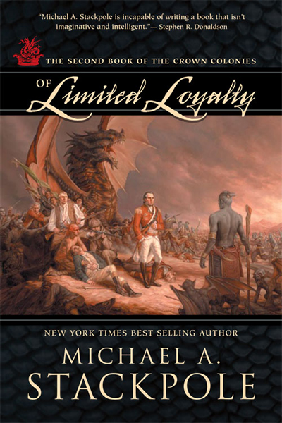
Back in February, I was assigned the sequel to At the Queen's Command, by Michael Stackpole. The aesthetic of the sequel was similar to the first; I needed to imitate the style of 18th century painting but depict an 18th century in which dragons, zombies, and a mysterious race of underground-dwellers shared the earth with humans. And while At the Queen's Command asked for a specific painting to mimic, Of Limited Loyalty was a little more open-ended.

The short story is that I went with these two John Trumbull paintings:


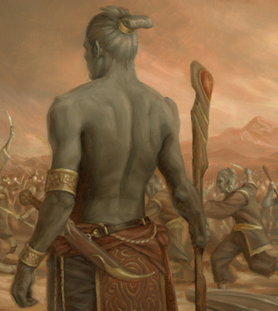
The top painting would serve as the model for the composition and the bottom would provide color inspiration. I took that basic outline and began planning where the major characters in the book would go. The dragon (or wurm, technically) in At the Queen's Command had been transformed into a larger monster with wings and Gila Monster coloring. Also important were the grey-skinned, magical humanoids that were to be shown in conflict with the humans. I tied these creatures together, and replaced the figures in the Trumbull painting with the book's characters. The sketch I submitted was approved on the first round and I was ready to go to final.

I prepped the 20x30 canvas and used a projector to transfer the sketch to the final size. Here, I'm tracing the projected sketch onto the final surface.


But I had much more drawing to do. The traced outline was only a compositional guide. I still needed to refine the drawing much more. Below, you can see the final drawing taking form over the loose outline. The biggest problem was the character in the fur cap. He went through many revisions until he didn't look like he was shooting the main figure in the back.


The following animation shows my progress after each work day. Fifteen stages over fifteen days … just in time for the deadline.


I painted a loose color study before working, so I knew the hue and values I wanted over the entire painting. As a result, I could work on small areas of the canvas and be fairly certain the whole thing would tie together. I could paint a small amount of background color around each character and then work on the figure, so that I could get the edge quality I needed right away; I wouldn't have to go in later and try to blend all the edges to various degrees.


So anyhow, here's the smallish version of the whole illustration (click for a bigger view).


And some details:


And the final cover from Night Shade Books:

Tuesday, April 19, 2011

Switching gears

A couple new jobs came in, so I decided to put off the photo reference session mentioned below to another day. As is so often the case, I now need to switch gears and go back to sketching. As I have things to post, I will post them.

I the meantime, check out my dad's new office; the only collection of my work on permanent display ...

Friday, April 15, 2011

The process continues ...


Today, I continue preparing the canvas. Usually, I use Yes brand canvas, which is halfway between canvas and paper. It provides a fine grain texture that is easily adjusted for your specific use. I'll usually go over the surface a few times with gesso. I'll usually leave brushstrokes going in a horizontal direction or get more creative, letting the brushstrokes follow the action.

Once there are enough layers of gesso, I'll sand the dried surface gently to smooth out the sharp bumps and brushstrokes. After sweeping away the gesso dust, I will usually prop the canvas against the wall and coat the entire thing with a layer of water, starting at the bottom and moving up.

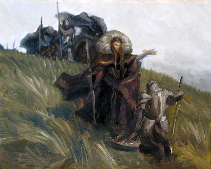
Pictured above is my color study. We have a defeated knight, surrendering to a dark queen and her minions. Or, perhaps he is willingly joining forces with her. The story doesn't matter to me as long as there is a story. Being ambiguous is good; it allows viewers to interpret their own adventure.

As for the palette, I have a small variation on a combination I discussed earlier: Ultramarine Blue, Transparent Red Oxide, Yellow Ochre, and Winsor Red.

Tomorrow, I will try to shoot photo reference.

Thursday, April 14, 2011

Easter Island

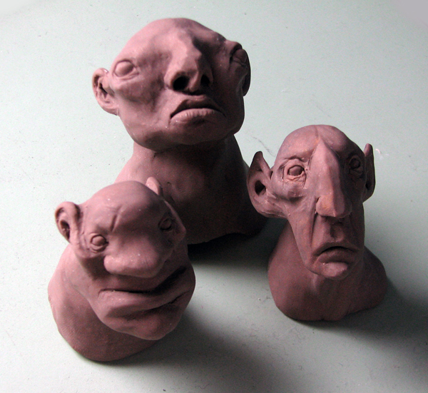
I might get a chance to do a personal project in the coming weeks ... or possibly, get started on one. I'm hoping to make it big (30x40) and supplement it with some fairly involved photo reference. So while I collect props and costumes (and models), I got a jump on things and sculpted some trolls. The mini monoliths are now watching over my drawing table.

The rest of the project is still in the thumbnail stage ...

Thursday, March 24, 2011

Gathering Inspiration

Movies are a great source of inspiration. The good ones, at least.

The really well-made movies have a great sense of color and composition. Period pieces offer terrific historical information as well. I try to capture all that information. Using the VLC player, I can pause DVDs at any time and take a snapshot of the screen. These snapshots are quickly becoming an important part of my reference file.

The snapshot above is from Elizabeth: The Golden Age. Not only is the composition interesting, but the hue and lighting are great. For a future piece, I may be inspired by this image and use it to spot test color and value.

And if you use the mosaic filter on Photoshop to simplify the color, you have the basis for a pretty decent palette. Bonus!

Thursday, March 17, 2011

New High-Res Scans

Check out the new photos of my work from Boston Photo Imaging (click through for an even better look):


I highly recommend Boston Photo Imaging for all the Boston-area artists out there.

An update on my palette


Reading James Gurney's Color and Light has given me a lot to think about in terms of my palette. Most of my choices in the past have been gut reactions to the given assignment. To a certain extent, that's still the way I approach it. Still, I'm trying to use a more academic approach.

One example is that I have started to use color wheels. For the past few assignments, if I try a new palette, I record it. The upper left is the "Zorn Palette"- black, cadmium red medium and yellow ochre. I became fascinated with this combination and using it, I painted "The Victor," or "the painting with the girl pirate," whichever you prefer.

Obviously, that had limitations, especially in the blue spectrum. For a recent Magic card I needed more intense colors. The upper right wheel was what I settled on. Ultramarine Blue was the main color, and that was complemented by Ultramarine Pink and Naples Yellow, two colors that would not dull the blue or pull the painting out of the blue family. In addition, I believe I used ivory black to darken the ultramarine blue and Indian yellow to provide a transparent substitute for the Naples Yellow. (I used both yellows in very, very small amounts; in fact, I may have discarded Naples altogether).

The most recent color wheel represents my most recent pieces. The bottom left has great potential:

Ultramarine Blue Deep
Transparent Red Oxide
Yellow Ochre
with the addition or subtraction of
Naples Yellow
Cadmium Yellow
Cadmium Red
Venetian Red
Ivory Black

By using UBD, TRO and YO as the base wheel, I can achieve a dark color similar to black by mixing UBD and TRO and a warm light by mixing TRO and YO. The addition of the high and low chroma reds and yellows can round out the piece where needed, but I don't think I would ever use all of them on the same piece.
This is still a work in process, but I think I am on the right track. I think my next Magic card involves some green, so I will have to experiment with new color wheels. Maybe I'll add Viridian to the mix? Or perhaps I'll try different Blue-Yellow mixes?

Saturday, March 12, 2011

Update

I just finished a fifteen day stretch of some of the most intensive painting I have ever done. Six main figures, plus various creatures and around 20 minor figures, all for the sequel to At the Queen's Command. Beyond that, I shouldn't comment, although the title and the synopsis have been online for a while. Now, I am traveling back to Connecticut to get the piece scanned for submission. I hope it reproduces well, because I like it better than the illustration for the first book:


So while that doesn't excuse the absence, it does explain it. But don't worry, I took photos of the process which I will post here when the image is officially published.

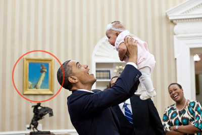
In the meantime, I noticed this photo online. Before I saw this, I did not know that the Oval Office had a Norman Rockwell hanging in it. Apparently, right above the Frederic Remington sculpture, The Bronco Buster, hangs Rockwell's Working on the Statue of Liberty.


Tuesday, February 22, 2011

More art! More sales!

Dungeons and Dragons released Fortune Cards recently. I suppose they are cards that somehow determine your fortune within an adventure. I'm not really sure. All I know is that last August I did 5 small, quick illustrations for the product. The original illustrations are on 8x10 canvas.

More than anything, I enjoy painting character portraits. The human body is a lot of fun to paint, and faces are even more fun. You can infuse so much personality into a piece just by adjusting the small details.


What also makes character portraits interesting is opportunity to inject the painting with the personality of the model. In the portrait of the Norse hunter girl above, I used my girlfriend Shelly as the model for the face. Shelly is certainly not Scandinavian. She doesn't have pale skin, or blond hair, or blue eyes. So she finds this painting really funny.

On a related note, I'm selling a booster box set of Fortune cards on eBay. This is only a 7-day auction , so get bidding!

Friday, January 28, 2011

Vedalken Infuser


This new Magic card had no concept from the art director, other than, "paint me a cool Vedalken of your design." This is great for an artist to hear and I think in this piece I did what I had hoped to accomplish. I just wish I had planned out a stunning background, but at the time I wanted to simplify for some reason. That said, it's still the best of my recent work and the only one I will post to my site.


I provided a detail to show you what I was most proud of. Whether by the grace of the art gods or by luck, I was able to maintain the transparency of the shadows. I love this effect, but can rarely achieve it. The opaque illuminated head merges quite nicely with the brushstroke-y transparent shadows.

Friday, January 21, 2011

Tangents are annoying.

As I was putting down my most recent project on canvas, I was struggling, as I always do, against tangents. Tangents are an interesting feature of high school geometry, but are very annoying for artists.


For instance, take a look at the two T. Rex above. You can't really tell which Thunder Lizard is in front of the other, or whether they have dipped their tails in a tar pit and are stuck that way. The tangent of their two tails meeting is uninformative and draws way too much attention to itself.

Above is an improvement. Now we have more information, a little visual weight and we can now concentrate on the subject of the drawing.

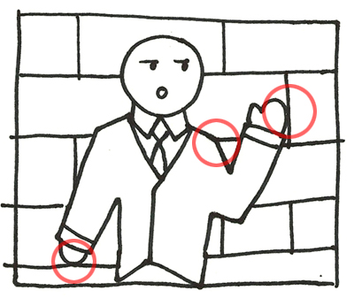
But tangents get more annoying as the complexity of the image increases. In this drawing, All the circled points need to be addressed. Either I need to change the proportion of the bricks, or I need to change the position or pose of the figure. The shoulder area is not really a tangent, but the meeting of the shoulder with the brick edge is distracting.

Tangents and awkward line intersections happen automatically and often. My mind always wants to join two lines neatly. I always have to fight that response in favor of a more pleasing solution. By the way, enjoy these sketches because they are some of my best work recently.

Tuesday, January 11, 2011

Updates, updates ...

I'll be honest. In recent weeks, I have sort of been climbing out of a professional hole. While fixing mistakes and trying to get ahead, I have not been blogging. Meanwhile, my friend Steve Belledin has been writing some great posts over at his blog. I'm feeling outblogged, so here we go:

While finishing assignments I can't show you, I have been gathering the last of my Spectrum entries. This year I'm making some changes to the presentation of my entries. For the first time, I'm using plain old CVS photo prints. These look amazing and even if the color is off a little, the price is right. Plus, I'm spacing out the delivery of my images so I won't be competing against myself on the judges table. If they accept more than one into the book I will know if my plan worked.

Also, I was so impressed with James Gurney's Color and Light, that I ordered the book most people read first: Imaginative Realism. I'm almost done reading it. I would love to show it to anyone who has asked, "What do you do?" It's the step-by-step textbook for any artist creating fantasy works in a realistic style. I'll say it again: I wish I had this five years ago.

I'm also working on personal assignments whenever I have a chance. My goal is to create three large scale personal pieces this year. I'm getting there in five-minute-intervals.

Tuesday, December 28, 2010

Christmas Break

I'm spending about a week at home in Connecticut for the Christmas Holiday. Unfortunately it's not a total vacation, as there are still projects due. So I set up a miniature studio next to the Christmas stockings in my parent's downstairs family room.


In terms of Christmas gifts, I got a lot of useful items for my business. My collection of historical costumes and props keeps growing with the addition of a breastplate, shoulder pauldrons, a cowboy pistol, holster and ammunition belt. I will probably try to take some shine off the armor, but I want to do some research on the process before starting.


And I also got some fake tattoos. It's a fake cigarette, too. Don't smoke, kids.

Sunday, December 19, 2010

Current sketchbook excerpts


After a long hiatus, I started a new sketchbook a few weeks ago. Most of the pages are junk, but that's fine with me. I tend to sketch in the morning as I'm drinking my coffee. I find that the morning haze allows me to be more free with my ideas and I'm less concerned with how things are presented on the page. Much like dreams, I usually forget what I drew later in the day and sometimes it turns out to be a pleasant surprise.