Showing posts with label clients. Show all posts

Wednesday, September 7, 2011

Mythic Rare

The world of Magic: The Gathering can be a random place. Artists generally have no clue whether their art will be used on a very powerful card or a relatively weak one. Army of the Damned is the first mythic rare card I have illustrated, meaning it's the most rare and generally the most powerful kind of card. A total surprise to me.

The assignment was to illustrate the inside wall of a cottage barricaded against a horde of zombies. The importance of the card clearly had to do with the many, many zombies, but the hardest part for me was to make a cottage wall compelling. Architecture, even a rundown cottage, is difficult for me to paint. Add in tons of arms and hands and the assignment becomes a big undertaking.

I don't have a larger image of the painting because I mailed it in before I could photograph it. Honestly though, I enjoy the art more on the card than I did in person.

Monday, August 29, 2011

Innistrad Prerelease

It's that time of the year again: the new expansion set of Magic: The Gathering is coming out. Called Innistrad, it's the game's take on Gothic horror. The Mana Core will be hosting a Prerelease event in Providence, RI, and I will be there signing cards.

Coincidentally, I illustrated the promo card that will be given out at the event. It's a double-sided card in which the Mayor of Avabruck (below) turns into Howlpack Alpha (bottom). This is breaking the mold in the world of Magic, so it will be interesting to see how players deal with the new cards.


There are many things I did right with these illustrations. But, as always, there are things that I definitely could have improved upon. Maybe I'll cover those things in a future art-related post.

Tuesday, July 26, 2011

Return to Blogging: Of Limited Loyalty

This is obviously my first blog post in quite a long time. Over the past couple of months, I felt uninspired about the state of my own work. It did not affect the quality of the work I was creating (recent work has been pretty good, actually), but I certainly did not feel like blogging. It's very hard to fake enthusiasm, so I decided to spare the Internet community my thoughts until I had something meaningful to say. So here it is: my return to blogging.

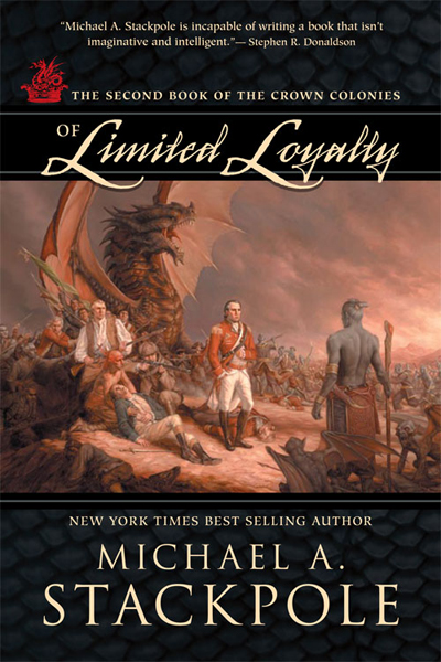
Back in February, I was assigned the sequel to At the Queen's Command, by Michael Stackpole. The aesthetic of the sequel was similar to the first; I needed to imitate the style of 18th century painting but depict an 18th century in which dragons, zombies, and a mysterious race of underground-dwellers shared the earth with humans. And while At the Queen's Command asked for a specific painting to mimic, Of Limited Loyalty was a little more open-ended.

The short story is that I went with these two John Trumbull paintings:


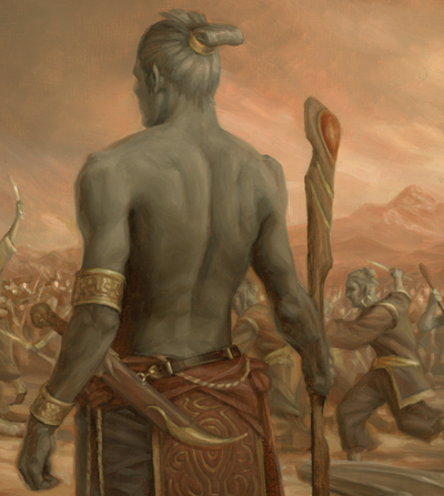
The top painting would serve as the model for the composition and the bottom would provide color inspiration. I took that basic outline and began planning where the major characters in the book would go. The dragon (or wurm, technically) in At the Queen's Command had been transformed into a larger monster with wings and Gila Monster coloring. Also important were the grey-skinned, magical humanoids that were to be shown in conflict with the humans. I tied these creatures together, and replaced the figures in the Trumbull painting with the book's characters. The sketch I submitted was approved on the first round and I was ready to go to final.

I prepped the 20x30 canvas and used a projector to transfer the sketch to the final size. Here, I'm tracing the projected sketch onto the final surface.


But I had much more drawing to do. The traced outline was only a compositional guide. I still needed to refine the drawing much more. Below, you can see the final drawing taking form over the loose outline. The biggest problem was the character in the fur cap. He went through many revisions until he didn't look like he was shooting the main figure in the back.


The following animation shows my progress after each work day. Fifteen stages over fifteen days … just in time for the deadline.


I painted a loose color study before working, so I knew the hue and values I wanted over the entire painting. As a result, I could work on small areas of the canvas and be fairly certain the whole thing would tie together. I could paint a small amount of background color around each character and then work on the figure, so that I could get the edge quality I needed right away; I wouldn't have to go in later and try to blend all the edges to various degrees.


So anyhow, here's the smallish version of the whole illustration (click for a bigger view).


And some details:


And the final cover from Night Shade Books:

Saturday, March 12, 2011

Update

I just finished a fifteen day stretch of some of the most intensive painting I have ever done. Six main figures, plus various creatures and around 20 minor figures, all for the sequel to At the Queen's Command. Beyond that, I shouldn't comment, although the title and the synopsis have been online for a while. Now, I am traveling back to Connecticut to get the piece scanned for submission. I hope it reproduces well, because I like it better than the illustration for the first book:


So while that doesn't excuse the absence, it does explain it. But don't worry, I took photos of the process which I will post here when the image is officially published.

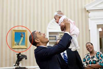
In the meantime, I noticed this photo online. Before I saw this, I did not know that the Oval Office had a Norman Rockwell hanging in it. Apparently, right above the Frederic Remington sculpture, The Bronco Buster, hangs Rockwell's Working on the Statue of Liberty.


Tuesday, February 22, 2011

More art! More sales!

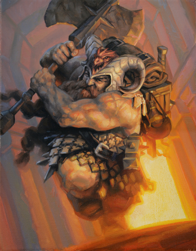
Dungeons and Dragons released Fortune Cards recently. I suppose they are cards that somehow determine your fortune within an adventure. I'm not really sure. All I know is that last August I did 5 small, quick illustrations for the product. The original illustrations are on 8x10 canvas.

More than anything, I enjoy painting character portraits. The human body is a lot of fun to paint, and faces are even more fun. You can infuse so much personality into a piece just by adjusting the small details.


What also makes character portraits interesting is opportunity to inject the painting with the personality of the model. In the portrait of the Norse hunter girl above, I used my girlfriend Shelly as the model for the face. Shelly is certainly not Scandinavian. She doesn't have pale skin, or blond hair, or blue eyes. So she finds this painting really funny.

On a related note, I'm selling a booster box set of Fortune cards on eBay. This is only a 7-day auction , so get bidding!

Sunday, December 5, 2010

Kingdom of Summer

Browsing on Amazon yielded this little surprise:


It's Kingdom of Summer, by Gillian Bradshaw, the sequel to Hawk of May. KOS is scheduled to be released in the Spring, and the final book in the trilogy (hopefully) will be published in the fall of 2011.

Saturday, October 23, 2010

New Book Cover: At the Queen's Command

I found this online today: At the Queen's Command, by Michael A. Stackpole was recently released by Night Shade Books. The cover illustration is mine, done early in the summer.


The idea was to replicate a John Trumbull painting depicting the French and Indian wars. The horses of the English were to be replaced by wingless dragons, and the French were using both Native Americans and zombies. Art Director (and fantastic illustrator ) Dave Palumbo gave me a couple paintings as reference, including this one:


It was daunting to say the least. I knew I would have to tackle as many figures as I could but still do something within the deadline. Plus, there were a certain number of characters I had to include. I did a quick sketch to show Dave my idea and where I was planning to put the characters. The rest of the figures were to be filled in if I had time.


Admittedly, it was a quick sketch. I decided to replace the dead horse with a stone wall and eliminate a few of the riders behind the main character. I tried to imagine myself as an 18th century painter in designing the dragon. I thought that since the horses in the Trumbull painting looked a little thin and unimpressive, I would tone down the dragon a little. I figured an 18th century painter would be working from stories and maybe quick sketches, drawing dragons that looked more like medieval depictions of the creatures. To my surprise, the sketch was approved to go to final on the first round.

I got to work, and two weeks later, I sent the final to Dave.


But he had some concerns. To a certain extent, I had misunderstood the concept and look they were going for. They wanted a more fierce looking dragon, since it was to be the focal point of the cover. Also, I gave them a color intensity that might have existed in a new John Trumbull painting and they wanted a more "aged" appearance. This was Friday evening. I was leaving for a trip to Utah early the following week.

I raced back to the studio and got some paints and a piece of illustration board. I took the original sketch and transferred the dragon sketch to the new surface. I drew a more, in Dave's words, "bad-ass" dragon over the previous design and started painting, using the same color palette as the painting.

The following morning, I went back to the studio and photographed the new dragon head. In Photoshop, I took the new dragon and pasted it into the original painting. I had to use a few color matching techniques, but it worked pretty well. Finally, I used a few color layers and adjusted the levels to get it more yellowed and darkened. The result is what you see on the final product:


I hate using the computer. I really do. But in this case, it definitely made the piece better. More exciting, more moody. So kudos to Dave Palumbo. I just need to make sure I understand the goals of the project a little better right from the start, so I don't need to scramble at the end.

Click any of the images above for a better view. Here's a detail:

Friday, September 10, 2010

Myr Token

I found the following image on the Magic: The Gathering site. It's a diagram illustrating a certain card mechanic:


With a little rotation and a crop ...


It appears to be one of the new token cards for Scars of Mirrodin! When a Houston GP attendee back in February asked if I knew what a Myr looked like and if I could draw one, I smiled to myself. Little did he know that I had recently painted this image.

Monday, September 6, 2010

Time for a new set already?

Well, look what I found today ... One of the first cards spoiled from the Scars of Mirrodin set of Magic: The Gathering:


This was a really fun one to paint. If I can't paint a humanlike creature, an Insect Horror is pretty good. For those interested players, I will be attending the Boston Scars of Mirrodin Regional Pre-Release at the end of the month. Details to come ...

Tuesday, June 15, 2010

Mind Control

Looks like one of my new cards was slipped into a new Magic deck a couple of months before I expected it to show up. For the Magic players out there, it's not a new card. Illustrator Mark Tedin did the previous illustration for the same card, and this is a new spin on the art.

But the best part is that one of my cards is finally sparking discussion:
http://forums.mtgsalvation.com/showthread.php?t=248892

Is the humanoid figure a Magic character called Jace? Some players say "yes," some say "no." Is the beast something that has appeared before, or something new? I know the answer, but I'll let the mystery continue ...

Sorry I haven't posted in a while. My nose has been pressed to canvas for weeks now. I'm taking a coffee break right now, so I decided to do a quick post.

Friday, May 28, 2010

Busy month!

May was the busiest month in my professional career. A cover illustration for Metal, Magic and Lore, two spot illustrations for Dungeons & Dragons, and two Magic cards. My last deadline was today, so the finals were shipped yesterday. Whew!

I have two big jobs in June. One book cover for Sourcebooks, and one book cover for Night Shade Books, both in the historical fantasy genre. Dave Palumbo hired me for the Night Shade job. Apparently, in addition to being a fantastic illustrator, he works as an AD. I won't say much, but I'll certainly be using my collection of historical costumes. Stay tuned, because I'll post new work as soon as I am contractually allowed.

But today, it's about time I catch up on everything. Invoicing, banking, cleaning, priming canvases, blogging ...

Wednesday, May 19, 2010

Hawk of May


Look what I found on Amazon. It's Hawk of May, published by Sourcebooks, and featuring my illustration! Its the story of Gawain, one of King Arthur's knights. On Wikipedia, I found an image of Gawain, as illustrated by one of my heroes, Howard Pyle.

I like having a (small) connection to Pyle. It makes me feel closer to the great ones.

Here's the process for my illustration, as seen in this old blog post.

Friday, March 19, 2010

Hello again.

It's embarrassing how long it's been since my last post. I haven't been sick or out of town. Just apparently very neglectful of this blog.

On Easter weekend I fly out to Houston once again for the Houston Grand Prix. I still have to make a few more prints and organize my setup, but I'm pretty much ready.

A few weeks ago, I visited Dan Dos Santos at his studio to seek out advice. He was very helpful. I learned a lot and also learned how much I still have to improve my skills.

I'm staying busy, trying to stay ahead of the bills. Filing my taxes didn't help my bank account. That self-employment tax is a real killer. I mailed out two illustrations for Magic a couple weeks ago, and submitted sketches for new ones this week. I'm currently waiting to hear back. I'm finishing up two new portfolio pieces. As soon as they are varnished and photographed, I'll post them here and on my website.

I could really go for a big assignment right now. Fingers crossed ...

Friday, February 26, 2010

New book cover illustration!

My new project was completed two weeks ago: an illustration for the cover of a book to be published by Sourcebooks. My first real book cover. Here's how it went:


Started with my initial sketch. Printed it out and threw some paint on it to test the color I was thinking of using.


Made notations of the colors so I wouldn't forget the combinations when I actually started painting.


Photo reference came next, using props I either made or bought.


Drawing on the canvas.


Finished drawing.


Laid down the initial color layer, using the same colors as my test, but thinned with solvent. I use Gamsol, as it has the least amount of odor.


Started blocking in the face, using the established color, but in thicker applications. I like to start with the face since it sets the mood for the rest of the piece.


The pattern continued down the body; blocking in color in thin applications, then finishing off one area at a time.


With half the body done, I moved to the background. Since the top half of the body was going to blend into the background, I needed to establish both areas first so I could blend the two together on the lower half of his body.


The ground was next, followed by the feet. I then moved upwards to merge the two halves of his body.

Let it dry and varnished it. Photographed it and sent it off to the client. Click the image for a slightly larger view.

Thursday, January 28, 2010

Worldwake 3

In preparation of my trip to the Houston Regional Worldwake Pre-Release, I uploaded the full size images of the three Worldwake images. Click the appropriate link to see the largest size.

Full Size Nemesis Trap
Full Size Crusher Zendikon
LinkLinkFull Size Khalni Garden

...and over at magicthegathering.com, you can put together a puzzle of Nemesis Trap. You can collect the free wallpaper after you're done (Or, just click the link above).

Link