Showing posts with label products. Show all posts

Thursday, September 22, 2011

...And the rest of Innistrad

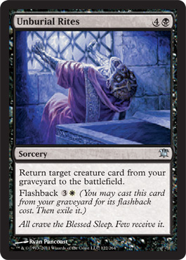
Here are my final three cards in the Innistrad set. I don't have too many things to say about these particular pieces and I don't have the full-size art yet. But while I wait for the originals to come back from Wizards, I'll share some thoughts.
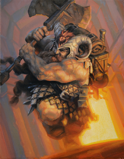
Unruly Mob was my final Zorn palette (cadmium red, yellow ochre, black, white) Magic card. You can't really see him too well, but the guy with the axe is one of my favorite human characters that I have painted for Magic. I don't even know why. I just think he's cool.

In Innistrad, for every standard piece commissioned to me, there were one or two pieces where the character was breaking into or out of something. Breaking out of a window, breaking into a cottage, or in the case of Claustrophobia, out of a coffin.

I painted this one upside-down for most of the process. I was trying to figure out why it didn't look right and finally realized that I had painted his cuffs falling toward the lid of the coffin. I repainted that area to fix gravity.

For Unburial Rites, the "breaking out" theme continues with a corpse trying to break out of a crypt. There was a time last year when I wished my characters could just stay where they were.

Monday, August 29, 2011

Innistrad Prerelease

It's that time of the year again: the new expansion set of Magic: The Gathering is coming out. Called Innistrad, it's the game's take on Gothic horror. The Mana Core will be hosting a Prerelease event in Providence, RI, and I will be there signing cards.

Coincidentally, I illustrated the promo card that will be given out at the event. It's a double-sided card in which the Mayor of Avabruck (below) turns into Howlpack Alpha (bottom). This is breaking the mold in the world of Magic, so it will be interesting to see how players deal with the new cards.


There are many things I did right with these illustrations. But, as always, there are things that I definitely could have improved upon. Maybe I'll cover those things in a future art-related post.

Tuesday, July 26, 2011

Return to Blogging: Of Limited Loyalty

This is obviously my first blog post in quite a long time. Over the past couple of months, I felt uninspired about the state of my own work. It did not affect the quality of the work I was creating (recent work has been pretty good, actually), but I certainly did not feel like blogging. It's very hard to fake enthusiasm, so I decided to spare the Internet community my thoughts until I had something meaningful to say. So here it is: my return to blogging.

Back in February, I was assigned the sequel to At the Queen's Command, by Michael Stackpole. The aesthetic of the sequel was similar to the first; I needed to imitate the style of 18th century painting but depict an 18th century in which dragons, zombies, and a mysterious race of underground-dwellers shared the earth with humans. And while At the Queen's Command asked for a specific painting to mimic, Of Limited Loyalty was a little more open-ended.

The short story is that I went with these two John Trumbull paintings:


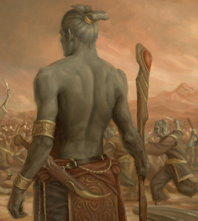
The top painting would serve as the model for the composition and the bottom would provide color inspiration. I took that basic outline and began planning where the major characters in the book would go. The dragon (or wurm, technically) in At the Queen's Command had been transformed into a larger monster with wings and Gila Monster coloring. Also important were the grey-skinned, magical humanoids that were to be shown in conflict with the humans. I tied these creatures together, and replaced the figures in the Trumbull painting with the book's characters. The sketch I submitted was approved on the first round and I was ready to go to final.

I prepped the 20x30 canvas and used a projector to transfer the sketch to the final size. Here, I'm tracing the projected sketch onto the final surface.


But I had much more drawing to do. The traced outline was only a compositional guide. I still needed to refine the drawing much more. Below, you can see the final drawing taking form over the loose outline. The biggest problem was the character in the fur cap. He went through many revisions until he didn't look like he was shooting the main figure in the back.


The following animation shows my progress after each work day. Fifteen stages over fifteen days … just in time for the deadline.


I painted a loose color study before working, so I knew the hue and values I wanted over the entire painting. As a result, I could work on small areas of the canvas and be fairly certain the whole thing would tie together. I could paint a small amount of background color around each character and then work on the figure, so that I could get the edge quality I needed right away; I wouldn't have to go in later and try to blend all the edges to various degrees.


So anyhow, here's the smallish version of the whole illustration (click for a bigger view).


And some details:


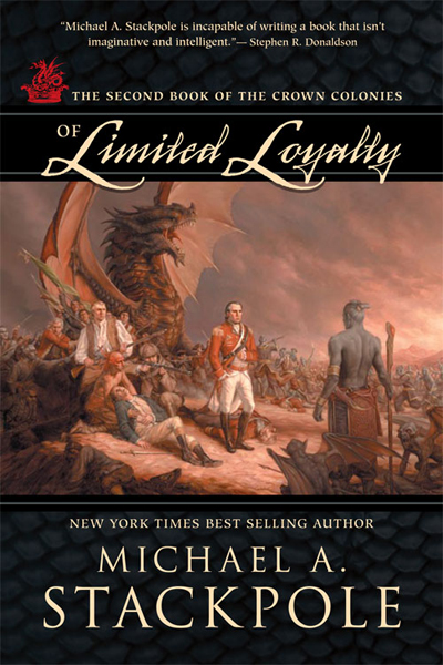
And the final cover from Night Shade Books:

Tuesday, February 22, 2011

More art! More sales!

Dungeons and Dragons released Fortune Cards recently. I suppose they are cards that somehow determine your fortune within an adventure. I'm not really sure. All I know is that last August I did 5 small, quick illustrations for the product. The original illustrations are on 8x10 canvas.

More than anything, I enjoy painting character portraits. The human body is a lot of fun to paint, and faces are even more fun. You can infuse so much personality into a piece just by adjusting the small details.


What also makes character portraits interesting is opportunity to inject the painting with the personality of the model. In the portrait of the Norse hunter girl above, I used my girlfriend Shelly as the model for the face. Shelly is certainly not Scandinavian. She doesn't have pale skin, or blond hair, or blue eyes. So she finds this painting really funny.

On a related note, I'm selling a booster box set of Fortune cards on eBay. This is only a 7-day auction , so get bidding!

Sunday, December 5, 2010

Kingdom of Summer

Browsing on Amazon yielded this little surprise:


It's Kingdom of Summer, by Gillian Bradshaw, the sequel to Hawk of May. KOS is scheduled to be released in the Spring, and the final book in the trilogy (hopefully) will be published in the fall of 2011.

Saturday, October 23, 2010

New Book Cover: At the Queen's Command

I found this online today: At the Queen's Command, by Michael A. Stackpole was recently released by Night Shade Books. The cover illustration is mine, done early in the summer.


The idea was to replicate a John Trumbull painting depicting the French and Indian wars. The horses of the English were to be replaced by wingless dragons, and the French were using both Native Americans and zombies. Art Director (and fantastic illustrator ) Dave Palumbo gave me a couple paintings as reference, including this one:


It was daunting to say the least. I knew I would have to tackle as many figures as I could but still do something within the deadline. Plus, there were a certain number of characters I had to include. I did a quick sketch to show Dave my idea and where I was planning to put the characters. The rest of the figures were to be filled in if I had time.


Admittedly, it was a quick sketch. I decided to replace the dead horse with a stone wall and eliminate a few of the riders behind the main character. I tried to imagine myself as an 18th century painter in designing the dragon. I thought that since the horses in the Trumbull painting looked a little thin and unimpressive, I would tone down the dragon a little. I figured an 18th century painter would be working from stories and maybe quick sketches, drawing dragons that looked more like medieval depictions of the creatures. To my surprise, the sketch was approved to go to final on the first round.

I got to work, and two weeks later, I sent the final to Dave.


But he had some concerns. To a certain extent, I had misunderstood the concept and look they were going for. They wanted a more fierce looking dragon, since it was to be the focal point of the cover. Also, I gave them a color intensity that might have existed in a new John Trumbull painting and they wanted a more "aged" appearance. This was Friday evening. I was leaving for a trip to Utah early the following week.

I raced back to the studio and got some paints and a piece of illustration board. I took the original sketch and transferred the dragon sketch to the new surface. I drew a more, in Dave's words, "bad-ass" dragon over the previous design and started painting, using the same color palette as the painting.

The following morning, I went back to the studio and photographed the new dragon head. In Photoshop, I took the new dragon and pasted it into the original painting. I had to use a few color matching techniques, but it worked pretty well. Finally, I used a few color layers and adjusted the levels to get it more yellowed and darkened. The result is what you see on the final product:


I hate using the computer. I really do. But in this case, it definitely made the piece better. More exciting, more moody. So kudos to Dave Palumbo. I just need to make sure I understand the goals of the project a little better right from the start, so I don't need to scramble at the end.

Click any of the images above for a better view. Here's a detail:

Wednesday, September 22, 2010

Glimmerpoint Stag

Last card of the Scars of Mirrodin set. Glimmerpoint Stag, the second elk I have illustrated for Magic the Gathering. But this one shines in the sun ... glimmers, I guess. Trying to figure out how all that light was bouncing off the multiple surfaces was a nightmare. Of course the job also called for two different color suns. But I feel it's fairly successful.

I also did half the piece with a sliced-open thumb and got stitches in the middle of completing the face. You can see I blurred out the art back in the February post.

Click the image for a better view.


Tuesday, September 21, 2010

Myr Propagator

Another new card!


I wasn't sure how I would go about composing this scene: A basic Myr standing beside a copy of himself that it made by tearing up the landscape around it ... in this case, the landscape is the Glimmervoid, which is made up of hexagonal tiles of metal. The Myr also had to be staring blankly at the viewer, emotionless.

I'm pleased with the image that resulted. Click through for a better view.

Thursday, September 16, 2010

Myr Art

The full art. Click through for a better view. I was lucky with this one. The day I mailed it to Wizards, I put a coat of varnish on it. Turns out, some red oxide in the lower right hadn't dried, and the varnish washed it away, spreading it all over the canvas. It didn't affect the look of the piece and I was quite happy with the texture it created. A rare happy accident.

Wednesday, September 15, 2010

The Myr

There are bunch of interpretations of the Myr in the upcoming set of cards, but here's what I came up with for the My Token:

Sunday, September 12, 2010

Plague Stinger

Here it is. The full art of Plague Stinger. Click through for a larger view. I'm proud of this one ...

Friday, September 10, 2010

Myr Token

I found the following image on the Magic: The Gathering site. It's a diagram illustrating a certain card mechanic:


With a little rotation and a crop ...


It appears to be one of the new token cards for Scars of Mirrodin! When a Houston GP attendee back in February asked if I knew what a Myr looked like and if I could draw one, I smiled to myself. Little did he know that I had recently painted this image.

Monday, September 6, 2010

Time for a new set already?

Well, look what I found today ... One of the first cards spoiled from the Scars of Mirrodin set of Magic: The Gathering:


This was a really fun one to paint. If I can't paint a humanlike creature, an Insect Horror is pretty good. For those interested players, I will be attending the Boston Scars of Mirrodin Regional Pre-Release at the end of the month. Details to come ...

Thursday, September 2, 2010

Zuran Orb

As promised, the full art of Zuran Orb. Click the image for a bigger view ...


Also, I'm selling a signed copy of the box set of FTV: Relics, complete with an extra signed Zuran Orb. Check out ebay ...


Friday, August 13, 2010

From the Vault: Relics

From the Vault is a popular collector's item for Magic players; reprints of old, popular cards that may or may not still be legal in play. All are printed on special foil backgrounds, and some of these cards come with new art. This year, the set is called From the Vault: Relics.

Here's my contribution:


... and for reference, the original card:


The original art (posted soon, promise!) for Zuran Orb is available for sale ... just shoot me an email.

Thursday, July 29, 2010

Tuesday, June 15, 2010

Mind Control

Looks like one of my new cards was slipped into a new Magic deck a couple of months before I expected it to show up. For the Magic players out there, it's not a new card. Illustrator Mark Tedin did the previous illustration for the same card, and this is a new spin on the art.

But the best part is that one of my cards is finally sparking discussion:
http://forums.mtgsalvation.com/showthread.php?t=248892

Is the humanoid figure a Magic character called Jace? Some players say "yes," some say "no." Is the beast something that has appeared before, or something new? I know the answer, but I'll let the mystery continue ...

Sorry I haven't posted in a while. My nose has been pressed to canvas for weeks now. I'm taking a coffee break right now, so I decided to do a quick post.

Wednesday, April 14, 2010

Rise of the Eldrazi cards

Here is the complete set of my cards from Rise of the Eldrazi:


Full art is coming soon ...