Showing posts with label projects. Show all posts

Tuesday, July 26, 2011

Return to Blogging: Of Limited Loyalty

This is obviously my first blog post in quite a long time. Over the past couple of months, I felt uninspired about the state of my own work. It did not affect the quality of the work I was creating (recent work has been pretty good, actually), but I certainly did not feel like blogging. It's very hard to fake enthusiasm, so I decided to spare the Internet community my thoughts until I had something meaningful to say. So here it is: my return to blogging.

Back in February, I was assigned the sequel to At the Queen's Command, by Michael Stackpole. The aesthetic of the sequel was similar to the first; I needed to imitate the style of 18th century painting but depict an 18th century in which dragons, zombies, and a mysterious race of underground-dwellers shared the earth with humans. And while At the Queen's Command asked for a specific painting to mimic, Of Limited Loyalty was a little more open-ended.

The short story is that I went with these two John Trumbull paintings:


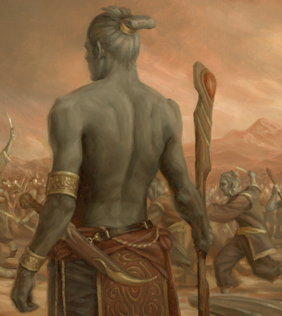
The top painting would serve as the model for the composition and the bottom would provide color inspiration. I took that basic outline and began planning where the major characters in the book would go. The dragon (or wurm, technically) in At the Queen's Command had been transformed into a larger monster with wings and Gila Monster coloring. Also important were the grey-skinned, magical humanoids that were to be shown in conflict with the humans. I tied these creatures together, and replaced the figures in the Trumbull painting with the book's characters. The sketch I submitted was approved on the first round and I was ready to go to final.

I prepped the 20x30 canvas and used a projector to transfer the sketch to the final size. Here, I'm tracing the projected sketch onto the final surface.


But I had much more drawing to do. The traced outline was only a compositional guide. I still needed to refine the drawing much more. Below, you can see the final drawing taking form over the loose outline. The biggest problem was the character in the fur cap. He went through many revisions until he didn't look like he was shooting the main figure in the back.


The following animation shows my progress after each work day. Fifteen stages over fifteen days … just in time for the deadline.


I painted a loose color study before working, so I knew the hue and values I wanted over the entire painting. As a result, I could work on small areas of the canvas and be fairly certain the whole thing would tie together. I could paint a small amount of background color around each character and then work on the figure, so that I could get the edge quality I needed right away; I wouldn't have to go in later and try to blend all the edges to various degrees.


So anyhow, here's the smallish version of the whole illustration (click for a bigger view).


And some details:


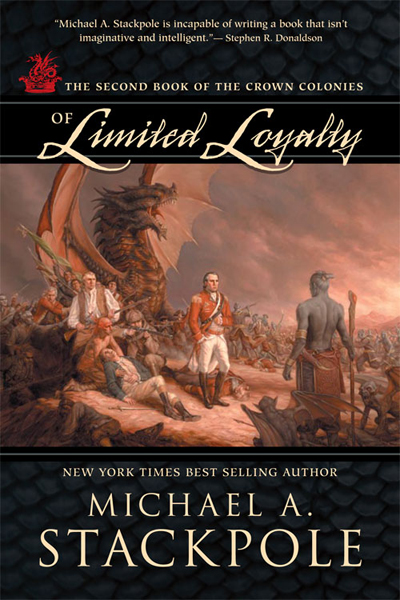
And the final cover from Night Shade Books:
Tuesday, April 19, 2011

Switching gears

A couple new jobs came in, so I decided to put off the photo reference session mentioned below to another day. As is so often the case, I now need to switch gears and go back to sketching. As I have things to post, I will post them.

I the meantime, check out my dad's new office; the only collection of my work on permanent display ...

Friday, January 28, 2011

Vedalken Infuser


This new Magic card had no concept from the art director, other than, "paint me a cool Vedalken of your design." This is great for an artist to hear and I think in this piece I did what I had hoped to accomplish. I just wish I had planned out a stunning background, but at the time I wanted to simplify for some reason. That said, it's still the best of my recent work and the only one I will post to my site.


I provided a detail to show you what I was most proud of. Whether by the grace of the art gods or by luck, I was able to maintain the transparency of the shadows. I love this effect, but can rarely achieve it. The opaque illuminated head merges quite nicely with the brushstroke-y transparent shadows.

Sunday, December 5, 2010

Kingdom of Summer

Browsing on Amazon yielded this little surprise:


It's Kingdom of Summer, by Gillian Bradshaw, the sequel to Hawk of May. KOS is scheduled to be released in the Spring, and the final book in the trilogy (hopefully) will be published in the fall of 2011.

Monday, November 29, 2010

The Victor

I debuted this painting at IlluXcon, and have finally gotten around to photographing it. I'll eventually have this painting professionally scanned, as this reproduction doesn't quite capture the contrast and color.

I'm proud of this one (the original painting, not so much the photo). It's certainly not perfect, but I feel it's going in the right direction. A higher resolution image is available on ryanpancoast.com.

Recently, I've been trying to limit my palette. This was a test of the "Zorn" palette: Ivory Black, Titanium White, Cadmium Red (Medium) and Yellow Ochre. Those four colors seem to fit my needs, and I can always add ultramarine or viridian if I need to. The project I'm currently working on calls for a strong blue light. So I started with some Scheveningen Blue, used a Venetian Red (instead of Cadmium), Yellow Ochre, Black and White. It's a Zorn-derived palette to suit the specific job.

You can read more about the Zorn palette on this great blog.

Saturday, October 23, 2010

New Book Cover: At the Queen's Command

I found this online today: At the Queen's Command, by Michael A. Stackpole was recently released by Night Shade Books. The cover illustration is mine, done early in the summer.


The idea was to replicate a John Trumbull painting depicting the French and Indian wars. The horses of the English were to be replaced by wingless dragons, and the French were using both Native Americans and zombies. Art Director (and fantastic illustrator ) Dave Palumbo gave me a couple paintings as reference, including this one:


It was daunting to say the least. I knew I would have to tackle as many figures as I could but still do something within the deadline. Plus, there were a certain number of characters I had to include. I did a quick sketch to show Dave my idea and where I was planning to put the characters. The rest of the figures were to be filled in if I had time.


Admittedly, it was a quick sketch. I decided to replace the dead horse with a stone wall and eliminate a few of the riders behind the main character. I tried to imagine myself as an 18th century painter in designing the dragon. I thought that since the horses in the Trumbull painting looked a little thin and unimpressive, I would tone down the dragon a little. I figured an 18th century painter would be working from stories and maybe quick sketches, drawing dragons that looked more like medieval depictions of the creatures. To my surprise, the sketch was approved to go to final on the first round.

I got to work, and two weeks later, I sent the final to Dave.


But he had some concerns. To a certain extent, I had misunderstood the concept and look they were going for. They wanted a more fierce looking dragon, since it was to be the focal point of the cover. Also, I gave them a color intensity that might have existed in a new John Trumbull painting and they wanted a more "aged" appearance. This was Friday evening. I was leaving for a trip to Utah early the following week.

I raced back to the studio and got some paints and a piece of illustration board. I took the original sketch and transferred the dragon sketch to the new surface. I drew a more, in Dave's words, "bad-ass" dragon over the previous design and started painting, using the same color palette as the painting.

The following morning, I went back to the studio and photographed the new dragon head. In Photoshop, I took the new dragon and pasted it into the original painting. I had to use a few color matching techniques, but it worked pretty well. Finally, I used a few color layers and adjusted the levels to get it more yellowed and darkened. The result is what you see on the final product:


I hate using the computer. I really do. But in this case, it definitely made the piece better. More exciting, more moody. So kudos to Dave Palumbo. I just need to make sure I understand the goals of the project a little better right from the start, so I don't need to scramble at the end.

Click any of the images above for a better view. Here's a detail:

Sunday, September 12, 2010

Plague Stinger

Here it is. The full art of Plague Stinger. Click through for a larger view. I'm proud of this one ...

Thursday, August 26, 2010

Another sketch

One more sketch from the painting that is being developed in my free time. It was more practice at self-modeling: setting the timer on the camera, jumping into position, checking the results and doing it again until I get what I want.

Thursday, August 19, 2010

Future project

Here's a sketch for a painting I am planning on doing between paying jobs. Click the image for a better view. Everyone needs a pirate painting ...

Friday, July 2, 2010

Oil sketch

Going on vacation for a week. I really need a vacation. Here's an oil sketch that I did in preparation for this piece. It served to loosen me up and eliminate bad color choices.

Monday, June 28, 2010

Reality TV

Whew! After about a month and a half of being completely swamped, I'm back. I was coaching high school track for a while, which definitely put me behind. Since that responsibility ended in mid-June, I have jumped nose-first into paints and canvas and haven't come up for air since. Now, I have just one more Magic card to get done by the middle of July and I can take a vacation for a couple days. I probably should be concerned that I have nothing else lined up in terms of work, but right now I'm so tired I don't care.

I was watching tv on Wednesday night and decided to watch Work of Art, Bravo's new show. A handful of contestants, artists all, compete to see who is the "best" artist. This week, the artists were assigned a classic novel to illustrate. They were given a day to complete the art. The winner got published by Penguin books.

I almost fell out of my chair. I wanted to jump right into the TV and show these chumps what-for. Most of the episode was difficult to watch, considering many contestants were butchering an easy assignment. However, I was happy to see that they showed the artists working, including sketches, reference photography and buying supplies. If anyone watches this show, they will at least learn that images don't simply emerge from the ether, but in fact must be crafted by a specific process.

The results were mixed; reminiscent of college critiques. Some artists knew they blew it. Some tried their best to B.S. their way out a complete train wreck. And some actually created something interesting. The winner was an illustration of The Time Machine. It had a retro pop feel to it that reminded me of some of the old 1960 - 1970 Society of Illustrators annuals I have in my possession. It was whimsical and I liked it.

Not sure if I'll watch it this week.

Oh, who am I kidding. Of course I will.

Friday, May 28, 2010

Busy month!

May was the busiest month in my professional career. A cover illustration for Metal, Magic and Lore, two spot illustrations for Dungeons & Dragons, and two Magic cards. My last deadline was today, so the finals were shipped yesterday. Whew!

I have two big jobs in June. One book cover for Sourcebooks, and one book cover for Night Shade Books, both in the historical fantasy genre. Dave Palumbo hired me for the Night Shade job. Apparently, in addition to being a fantastic illustrator, he works as an AD. I won't say much, but I'll certainly be using my collection of historical costumes. Stay tuned, because I'll post new work as soon as I am contractually allowed.

But today, it's about time I catch up on everything. Invoicing, banking, cleaning, priming canvases, blogging ...

Wednesday, May 19, 2010

Hawk of May


Look what I found on Amazon. It's Hawk of May, published by Sourcebooks, and featuring my illustration! Its the story of Gawain, one of King Arthur's knights. On Wikipedia, I found an image of Gawain, as illustrated by one of my heroes, Howard Pyle.

I like having a (small) connection to Pyle. It makes me feel closer to the great ones.

Here's the process for my illustration, as seen in this old blog post.

Wednesday, May 5, 2010

Big-time reproduction for a big-time occasion

The piece I call Wind Spirits is the work that was accepted into Spectrum 17. I submitted it in the "Unpublished" category. None of my published work made it in this year.

The artists now need to submit high-res files. The files I create with my camera and lights are suitable for internet use and small prints, but for this occasion, I decided to get it right. Don Sigovich in Westport, Conn. does a phenomenal job of scanning and reproducing artwork. He does his best to match color and give his clients great prints. He's also a RIT grad. Here is the result of his process:

You can see that the resolution is pretty impressive. You can even see the canvas texture ...

Saturday, April 17, 2010

Sara the Vampire Slayer

More new work! Sara the Vampire Slayer ...
full size Vampire Slayer

Friday, April 16, 2010

Angelball

New work! Angelball ...
full size Angelball

Thursday, April 15, 2010

RoE Full Art

Here are the large versions of my illustrations for Rise of the Eldrazi. Click through for the largest size. Enjoy.
full size Escaped Null
full size Affa Guard Hound
full size Shared Discovery
Full size Reinforced Bulwark

Friday, March 19, 2010

Hello again.

It's embarrassing how long it's been since my last post. I haven't been sick or out of town. Just apparently very neglectful of this blog.

On Easter weekend I fly out to Houston once again for the Houston Grand Prix. I still have to make a few more prints and organize my setup, but I'm pretty much ready.

A few weeks ago, I visited Dan Dos Santos at his studio to seek out advice. He was very helpful. I learned a lot and also learned how much I still have to improve my skills.

I'm staying busy, trying to stay ahead of the bills. Filing my taxes didn't help my bank account. That self-employment tax is a real killer. I mailed out two illustrations for Magic a couple weeks ago, and submitted sketches for new ones this week. I'm currently waiting to hear back. I'm finishing up two new portfolio pieces. As soon as they are varnished and photographed, I'll post them here and on my website.

I could really go for a big assignment right now. Fingers crossed ...

Friday, February 26, 2010

New book cover illustration!

My new project was completed two weeks ago: an illustration for the cover of a book to be published by Sourcebooks. My first real book cover. Here's how it went:


Started with my initial sketch. Printed it out and threw some paint on it to test the color I was thinking of using.


Made notations of the colors so I wouldn't forget the combinations when I actually started painting.


Photo reference came next, using props I either made or bought.


Drawing on the canvas.


Finished drawing.


Laid down the initial color layer, using the same colors as my test, but thinned with solvent. I use Gamsol, as it has the least amount of odor.


Started blocking in the face, using the established color, but in thicker applications. I like to start with the face since it sets the mood for the rest of the piece.


The pattern continued down the body; blocking in color in thin applications, then finishing off one area at a time.


With half the body done, I moved to the background. Since the top half of the body was going to blend into the background, I needed to establish both areas first so I could blend the two together on the lower half of his body.


The ground was next, followed by the feet. I then moved upwards to merge the two halves of his body.

Let it dry and varnished it. Photographed it and sent it off to the client. Click the image for a slightly larger view.

Ouch!

A couple hours after my last post, I was cleaning dried paint medium off an old palette. I was scraping away using a palette knife. I hit a hard spot in the medium and pressed a little harder. Then the fleeting thought went through my head, "Maybe this isn't a good idea."

Too late. The knife slipped and sliced the thumb on the hand that was holding the palette. Six stitches later, I was back to work. Lesson learned. When you think you're being stupid, you probably are. I'll have a nice scar on my thumb to remind me.

I finished up my Magic cards and sent them out today. I'm pleased with how they look. Now I have to bear down and work on more portfolio work in this upcoming lull. Here's one that I just photographed today: